The Subway as Intermediary Public Space
by Jay Shuffield
This is a working paper in which I have tried exploring several different issues involving public space in New York's subway. I consider this a first step, and would welcome any feedback you might like to offer.
to urbanresidue.com homepageThe means of transportation conditions the public realm of any city. In New York, the subway both orients the manner in which residents conceive of their city and creates spaces that disorient them. The subway forms anchor points1 for spatial conceptualization, as well as concentrating people and commercial uses, giving subway nodes a broader cultural centrality. At the same time, the subway distorts the physical relationships between places, and the stations confuse passengers’ sense of direction.
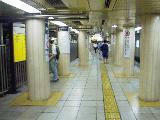
The subway establishes centers of activity. By only allowing people to enter and exit the transit network at a limited number of places, it creates concentrations of people. This concentration is more marked at stations where several subway lines converge, thus subway nodes tend to mark centers of activity in the city. Concentrating people is beneficial for businesses by creating social centrality.2 While places like suburban shopping centers must make deliberate efforts to foster social centrality, the areas around subway stations benefit from the centrality provided by the subway.
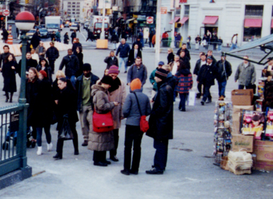
Groups of people (center) as well as businesses (newsstand far right) congregate around subway stations.
It should not be forgotten that many locations were chosen to become subway stations because they were already central places. Nevertheless, others became important places once they were connected by the subway. Times Square is probably the best example of the latter, as the Tenderloin District became "the Crossroads of the World" once the IRT line was built in 1904. Even with existing centers of activity, the subway is a crucial element in an interdependent system. Central places have been able to retain their importance because of their accessibility and concentration of people, and the subway remains viable because people take it to reach those places.
Because of the importance of the subway as a primary means of transportation, especially within Manhattan, it is one of the principal elements in the mental maps New Yorkers develop of the city. The subway stations serve as points of reference, as destinations within the city are viewed in relationship to the nearest station. The "tectonic plate" theory of spatial cognition could be used to explain the subway stations as an anchor point for conceptualizing the areas accessed by walking from the station.
Furthermore, the structure of the city is likely to be identified largely along the lines of the subway. As Catherine Grout explains:
It is no longer possible today to found an urban restructuring principally on architecture. This is not only because of the lack of space and financial means, but also because it is the circulation paths, the planning of networks, of connections, of nodes, that direct, since the end of the 60s, urban organization."3
The map produced by the MTA for the subway system can be expected to play a large role, as it is the only map that many people see with any frequency.
While the subway provides structure for mental maps, it also distorts them. The distances traveled by subway are perceived as shorter than distances walked above ground because of the gross disproportionality of time and the lack of visual reference, thereby shrinking the space between stations and stretching the areas around them. This too can be attributed in part to the prevalence of the MTA map, which alters the form of the city to privilege the location of the subways. The map stretches Manhattan, enlarging the areas surrounding the stations, while shrinking the outer boroughs where stations are spaced further apart or there are no stations at all. It also contributes to the reorientation of north to match the Manhattan grid. Traveling by subway also introduces gaps into mental maps, as entire sections of the city are removed from the vision of passengers, preventing them from becoming engraved on their minds.
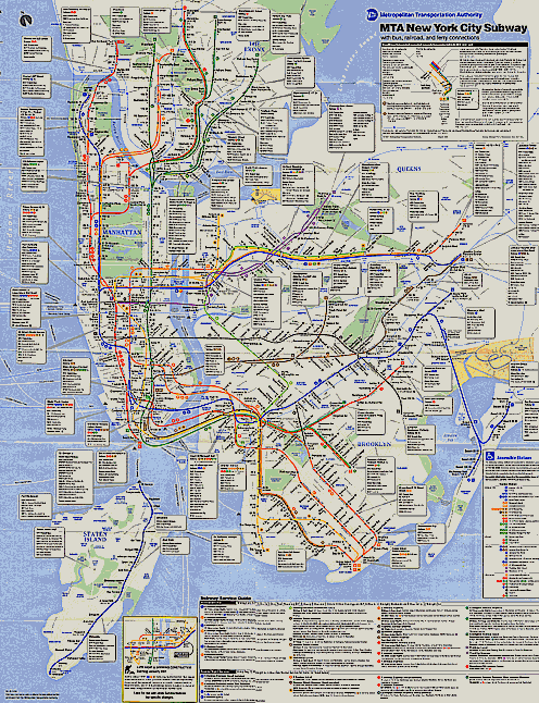
Notice that while Staten Island’s land area is roughly three times that of Manhattan, the MTA map represents it as about half the size.
The importance of the subway should not be exaggerated, as there are other characteristics that also privilege central places in mental maps. Architecturally significant buildings and other landmarks, common destinations, and social gathering places are all important factors in mental maps, but as mentioned earlier, these are largely interdependent with the subway.
It would be productive to undertake an extensive study of the relationships between spatial perception and the subway. Selecting an adequate sample of New Yorkers (accounting for characteristics such as age, sex, places of residence and work, etc.) to draw maps would yield productive results. Participants could be broken into two groups: one that would be asked to draw the city and another that would be asked to draw a map of the subway. The maps from both groups could then be compared against each other as well as against maps of the subway and the geographic shape of the city. Questionnaires addressing the distance residents perceive between different places in the city could also shed additional light on the role of the subway.
The subway stations are the primary spaces where people become disoriented in New York. The Manhattan street grid provides an almost perfect source of orientation, and even the streets in downtown Manhattan and Brooklyn are straight forward enough that people don’t normally lose their sense of direction. But in the subway, shadows and artificial light, confusing signage, uncertain locations of exits, indirect routes, and points that create friction in the flow of people can make navigating the station difficult and prevent passengers from grasping the directions above ground. Even finding the right entrance to a subway station can at times be a disorienting process. The working experience necessary to truly navigate New York subways efficiently makes the system that of the insider, and knowing your way through the worst of stations can be counted among the characteristics of the street-smart New York persona.
And while subway stations are fundamentally intermediary spaces, they are in themselves places with a semi-public role. The sequestered nature of subway stations largely prevents them from playing a fully public role. Only those who have paid an admission can enter beyond the mezzanine, and then only with the understanding that they are only passing through. Exceptions are made for entertainers, but they must be licensed and are carefully regulated.
This is due in large part to the necessity of maintaining the transit system. The farebox is important for the operation of any transit system, and large numbers of people need to be moved through the subway with a minimum amount of congestion. The need to keep people moving is integrated even into decorative aspects of station design. In her thesis for Historic Preservation at Columbia University, Paula Echeverri suggested that "The walls not only respond to the physical need for enclosure, [...] but give very subtle direction to a continuous movement along its sinuous surface, as if providing a sliding surface to an uninterrupted flow."
In addition to the finance-driven rational and need to move people through the stations, the fear of crime reinforces the imperative to prevent people from loitering, thereby preventing occupation by the homeless. The fear of crime led to the closure of public restrooms, marking the stations more as defensive areas than as places for civic participation. Fear in the subway also encourages people to psychologically remove themselves from the space. Interaction with others in the subway is generally kept to a minimum to prevent attracting uncomfortable and potentially dangerous attention from untrusted strangers, and many people resort to turning their walkman up or wearing sunglasses to separate themselves from the shared space. Thus the subway takes much more the role of a space of alienation than that of a public space.
The poor state of repair of many stations additionally reduces the subway's potential public role. While the New York subways, and public transit in general throughout the country, have been given renewed attention lately, during the 1970s the neglect of transit facilities was acute and continues to shape people's perceptions. In 1974, Peter Wolf wrote:
Using most older urban public transit in America is a choice of last resort. It is generally poorly located, inconvenient to reach, overcrowded, environmentally unacceptable in terms of light, temperature, and sound, and generally depressing, as expressed in this painting by George Tocker. In addition, the badly repaired, unattractive, dimly lit New York subway stations and their maze of security gates, iron railings, and narrow stairways do convey a sense of unpleasant enclosure, even entrapment in a chaotic and temporary urban jail, involuntarily entered and gladly left.4
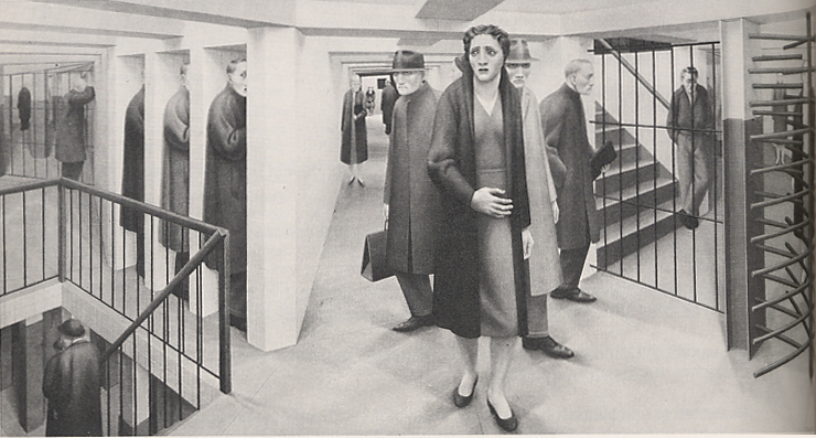
"The Subway" by George Tocker, 1950. (from Wolf)
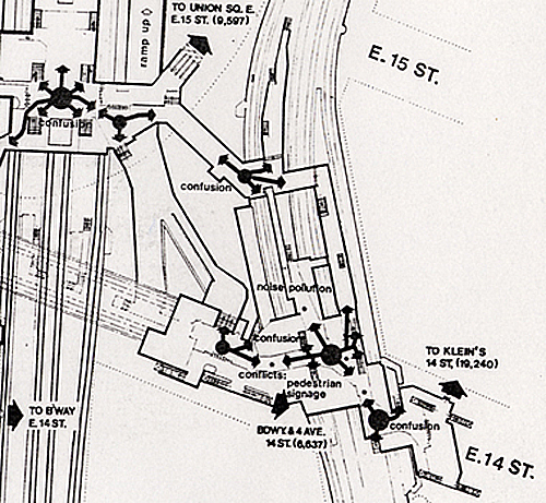
Planners identified confusion, friction between passengers (conflicts) and noise polution as problems at the Union Square station in 1976.5
Places that are unpleasant and alienating will cause people to avoid them to the best of their ability. This has caused public transit to become a largely segregated space, as those without alternatives are isolated in the public transit system. In the New York subway this has been only moderately realized because of fewer available alternatives.
Despite the negative aspects and negligence that have typically taken center stage in the representation of New York's subways, there is a still a symbolic language that orients passengers. The subway lines are represented not only by their number or letter, but also by symbols. These symbols, the colored circles with the line's number or letter in the center, are so recognizable that the MTA is able to sell T-shirts featuring the symbol for different lines. These symbols are additionally grouped into a hierarchy, making it easier to use them for navigation through stations for connections. All the lines that share the same trunk line are coded the same color, while the individual lines have separate numbers or letter. Thus the 1, 2, 3, and 9 trains all share the same route through most of Manhattan, separating as separate branches at the ends. Often it is only necessary to identify the color, which is easier to recognize from a distance, without regard for the number.
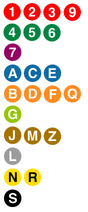
The symbols allow subway lines to be recognized at a glance.
The exteriors of the subway stations are also generally coded. The green and red globes communicate to passengers which entrances are open 24 hours, and which have
The pavilion at Franklin Street provides the green globes that indicate it is a 24 hour all-access entrance (left). Its secondary entrances are clearly marked with the red globes indicating limited access (right).
This entrance at Astor Place has a green object, although it is not a globe. While this conveys the same idea, it helps erode the recognition of the subway’s coded language.
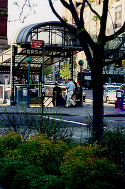
some type of limitation. Some subway stations have unique exterior designs that allow them to function as landmarks, which would enhance their role as organizing elements in mental maps. At the same time, the difference in architecture can undermine the coded language of entrance accessibility, as is the case at Union Square.
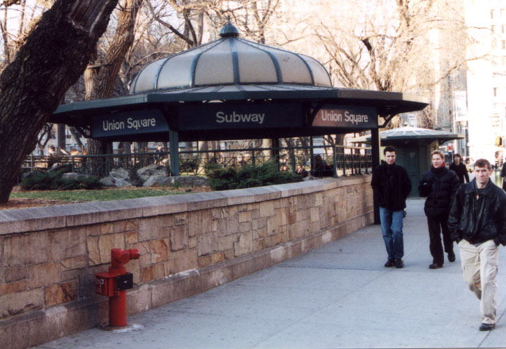
The pavilions over the subway entrances at Union Square are confusing landmarks.
The pavilions that mark the subway stations on the southern end of Union Square function as landmarks and help define the square. At the same time, the pavilion pictured above indicates to passengers that this should be the main entrance, although it is not. Without the red globe, which passengers would normally expect, it is not clear that this entrance does not have an attendant and is accessible uniquely through turnstiles that only accept Metrocards.
Among the characteristics that define the subway is a strong sense of enclosure, which creates a system of constrict and release. In terms of personal space, the subway generally holds passengers in close proximity for extended periods of time. This diminished, and often complete lack of, personal space creates a feeling of constraint.
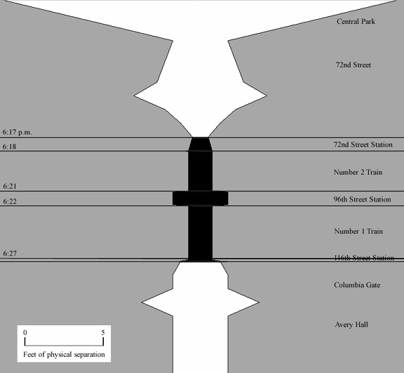
This diagram illustrates the constriction of personal space in the subway. The white areas represent the portions of the trip above ground, while those in black are the portion of the trip in the subway.
Diagrams of the distance of separation between people during a trip give a clear illustration of the degree of constriction achieved by the subway. While my schedule has not allowed me to perform systematic observations, the limited number of observations I could make during a few necessary subway trips support this hypothesis. Additional diagrams are provided in the Appendix. This method of diagramming would prove useful in generating a more complete picture of the subway experience, and should be followed up in a more comprehensive manner.
The physical separation of people does not explain the whole experience, however. In addition to the constriction of personal space, the strong degree of physical enclosure presented by the structural envelopes through which passengers pass also creates a sense of constriction. Specifically, sight distances are severely limited in the subway. As opposed to most buildings that provide views out of windows, and in stark contrast to the streets from which most stations are entered and exited, the subway limits the line of sight to short distances.
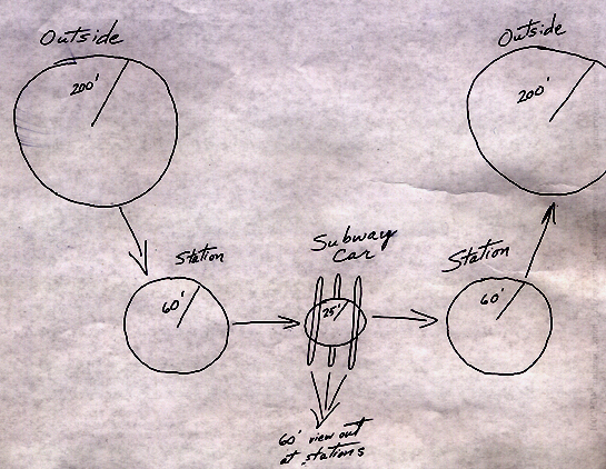
Approximate sketch of the changing open-view distances on a subway trip.
These forms of constriction provide a corresponding sense of release upon exiting the destination station. Unfortunately, this moment of release has not generally been recognized, and, in most cases, without figuring into the design of the stations or their surroundings, it loses its potential value.
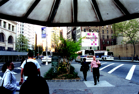
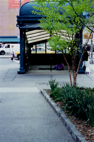
The Greenstreets triangle on which the Astor Place pavilion stands provides a relatively lost opportunity for a combination of open space and landscaping to frames the release from the subway.
Although New York's subways were started as private companies, they have traditionally been more removed from retail than other systems like those in Tokyo founded by department store companies as a way of funneling customers to their stores. In fact, there were protests when advertising was introduced into the first subway line in New York shortly after it opened in 1904. The subway was seen as a civic improvement; leading architects had contributed to its design, and the addition of advertisements was seen as an erosion of its civic character.6
New York's older stations are modern spaces (not to be confused with "Modernism" as a style): clearly defined, designed primarily in response to functional demands, and generally separating the public sphere neatly from its commercial surroundings. Many of the early stations did accommodate particular interests, but direct ties were uncommon, and subsequent stations became increasingly modern. The IND, for example, does not include any decorative artwork. It takes an esthetic approach, as well as a language for orientation, that relies on functional clarity. The spaces are broad and open and clearly aligned; the color of the tiles on the walls matches the color of the columns, and the stations are recognizable by their color, which changes in a progession on the color wheel at each express stop. The design of the IND stations was certainly influenced by more stringent budget constraints and superior engineering techniques. Nevertheless, their lay-out follows a clearly modern rationale.
Conforming to the modern notion of a unified and independent public sphere, subway stations, as intermediary public spaces, have generally been located in autonomous locations within the public-right-of-way. Even when it was deemed necessary to locate stations within buildings, they were generally placed within other intermediary public spaces, like Grand Central Terminal, or were given autonomous exits that did not directly connect with the commercial neighbors. Even in most of the cases where commercial uses were located in the subway, they were located within the entrance, where they became an extension of the street wall's commercial space, while the controlled, that is separated, area that represented the actual station remained unencumbered by commerce. An interesting exception is the IND portion of the Times Square station, where small stores line the concourse. This matches the exceptionalism that is Times Square, where commercial excesses are encouraged in contradiction to the rest of the city. It is perhaps similar to the approach taken to signs, which were allowed, then encouraged, and ultimately required to support the image of commercial excess that Times Square had developed. In other instances where the connections are made further inside, such as the uptown portion of the Astor Place station, there is a clearly designed architectural transition that marks a distinction between the station and the store.
It was recognized very early on that subway stations provided economic advantages to their surroundings. The cost of constructing a station, however, was largely prohibitive, and few businesses could afford it. The traction companies could not afford construction either, but rather turned to the City for funds. This has generally not been available in support of storeowners, however, as they were not recognized as a public function.
Newsstands have long occupied spaces within stations. These, however, are generally recognized as a public function and are likewise commonplace on sidewalks and in parks. While the inclusion of commercial ventures like newsstands does not directly challenge the modernist notion of a unified and autonomous public space, the changing acceptance of commerce as a public function, particularly as espoused by critics like Jane Jacobs7, is one of the steps that led to a postmodern conception of public space.
As both the recognition of the subway as a public space has declined and postmodern criticism has challenged the modernist notion of public space, the separation between stations and commercial space has declined.
The definition of the subway's public role is beginning to reflect the gaining dominance of postmodernism. Many of the recent renovations to the New York system, bring New York closer to the Tokyo model and conform more closely to postmodernism. The distinction between the space of transit and the surrounding city is becoming more blurred. Rather than separate spaces that correspond to rationally defined roles, the stations become an extension of the space of commercial transactions. The station, in effect, becomes a shopping mall, much as it is in Japan. This reinforces the role of shopping in these districts, and the extension of the domination of commercial space converts those with other purposes into deviants. Merely by moving about the city, those who do not intend to shop begin to intrude on spaces that have been assigned that role. Ultimately, the introduction of shopping aspires to a gentrification of the transit system.
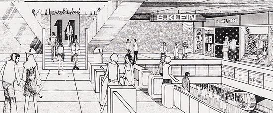
In the 1970s planners proposed directly tying the Union Square station to a department store. Notice that everyone portrayed is white, thin, and trendy.
(D.C.P. 1976)
Space where commercial uses dominate, rather than reside, cannot play an adequate public role. As the common areas are assigned a role that is predetermined, their use is no longer up for discussion. Unlike the newsstands, stores do not provide a provisional image and are not based on a role of fostering speech, thus a degree of privatization inevitably follows. As postmodern critics like Deutsche8 point out, once the use of space is no longer open for interpretation, as it is by making it commercial and rejecting other claims on its usage, it can no longer play a public role. So even though this type of commercial usage is often advocated by postmodernists, it does erode public space.
Postmodernism has redefined stations in other ways as well. Union Square is a good example. In the 1970s, planners did suggest connecting the station directly to a new store. While this project never materialized, the station was renovated. The new works of art, as well as fragments of the previous station design, reflect the postmodern rejection of a unified public sphere. While the tile mosaics of the stations worked together with the design of the station
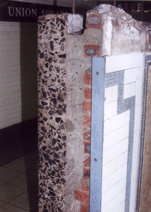
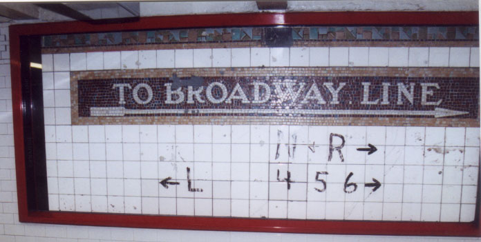
The use of fragments in the redesign of the Union Square Station makes passengers question their surroundings, but when not adequately integrated with the functions of the station it also disorients, as seen by the directions added to the sign on the right.
to provide a unitary narrative, the pieces that have been retained now call that narrative into question. By framing them and exposing them as fragments, rather than as a completed whole, the narrative of these mosaics is brought into the foreground, and questions about historical and social context surface.
While some postmodern art may cause confusion, there continues to be a need to improve the ability to orient passengers. Cities like Tokyo have long done a far superior job in this regard. Their messages are automated and clear. Additionally, the trains have displays that indicate the next station, complementing the announcements.
Areas on the platforms are clearly demarcated, indicating dangerous areas, and the places to stand for the car doors. Like many of Tokyo's sidewalks, most platforms also have bright yellow textured strips that inform those with impaired vision about paths and places to stop.
In Tokyo the platforms are clearly demarcated and the use of pictorial signs is clear and transcends language barriers. Also notice the bright yellow textured strips for the seeing impaired. (http://hisaai.tripod.co.jp/Eidan/index_eg.html; http://www.lemson.com/lemson/pictures/japan99/)
The signage is also clearer in Tokyo. For basic directions, pictorial signs can be grasped more quickly than reading, and prevent linguistic problems. Signs in Tokyo often provide directions in both Kanji and Romanji, making it easy for Westerners to identify stations, and instructions can be read by English-speaking foreigners. Many signs also use the Hiragana script, additionally allowing children and others with limited knowledge of the Kanji characters to find their way.

Signs in Tokyo provide information in several forms to accommodate different needs. (http://hisaai.tripod.co.jp/Eidan/index_eg.html; http://www.panix.com/~habs/japan4.html)
It is not surprising that the Tokyo trains do such a good job orienting passengers. The complexity of the street grid and the lack of correlation between the train routes and the street patterns make it difficult to grasp directions. The Tokyo trains are also more crowded during rush hour: so crowded that attendants at the busiest stations physically press people into the cars. It is thus necessary for the stations to be easy to navigate to and to provide adequate orientation upon exiting to accommodate the heavy fluxes of passengers. The facility of orienting oneself based on the signage is demonstrated by Tokyo residents providing directions based on particular exits. As my classmate Ann Yamamoto explained, "[I]n Tokyo, people are very aware of the relationship between train exits & the street surface. Subway exits are very well labeled (ie Exit 1W, 2W, etc.), and at each exit there is a very thorough list of nearby buildings. So, when receiving directions to get to an office, the key piece of information is often NOT the address, but rather which subway exit to use. In NYC can you imagine even trying to explain to someone which exit in Times Square they should use?"
New York could learn in terms of wayfinding from cities like Tokyo, and has recently adopted some of these techniques. Some of the East Side stations now have the areas for the doors demarcated so that people know where to stand. The use of the bumper strips to indicate the dangerous edge of the platform has already been in use in renovations for awhile, but it has yet to be incorporated to designate paths for the visually impaired.
The safety strips added to the edges of the platforms provide a physical stimulus to help warn passengers.
The automated messages and displays for the next station are currently being used on new trains recently put into service on the 4, 5, and 6 lines. These trains, however, do not entirely conform to the established symbols for the train lines, as the number on the front of the trains is lighted in red, instead of green as it should be. This is unlikely to cause confusion, as the 4, 5, and 6 generally have their own platform. Nevertheless, consistency is important for establishing a pattern of recognition, and probably factors into the MTA's marketing as well (they wouldn't want to lose T-shirt sales now would they?)
Interestingly, the new train cars feel more like an airport terminal train than the subway. As the subway has become part of the mystique of New York, becoming part of the tough persona of the city, the new cars seem sterile and foreign. They bring to mind Michael Sorkin's article in Variations on a Theme Park, where he criticizes an emerging way of life dependent on always going somewhere else, inhabiting architecture and cities that refer to other places, and never rising above the same sterilized places. The new cars offer a uniform and polite voice that reminds you not to lean against the doors, instead of a conductor yelling at people for holding the doors, threatening to have them fined a hundred bucks.
The difference is largely esthetic. Call it the glamour of grit. Nevertheless, as Deutsche labored to explain, removing conflict from space undermines its public role. Passing unperceived, the voice invokes an unseen but implicit control over the space by a white middle class. It is not, after all, the voice of an African-American or Latino, as the conductor's most likely would be. The automated voice further replaces spontaneous dialog, effectively transforming the city into a predictable and predetermined experience.
Finally, there is the issue of noise in the subway. In the 1970s planners identified the issue in terms of noise pollution, that is a level of noise that was unacceptably high for physical comfort. This is, of course, important. But limiting the level of noise only to an acceptable limit does not meet the orientation needs of passengers. While symbolic language can transmit a great deal of information, it must be received. When passengers are distracted by noise, they are less able to absorb this information. In their study of environmental stress on environmental cognition, G. W. Evans et al. found that noise undermined the benefits provided by recognizable landmarks in terms of subjects ability to relocate places.9
Conclusion
It is important to create a symbolic language and to design space in the subway in order to orient passengers, as public space cannot be realized in spaces that the public avoids. This additionally requires some attention to security.
While symbolic language can transmit indications for orientation, those indications must be received. Noise prevents the reception of those messages, and as such station design should focus as much on soundproofing and active sound cancellation technology that makes use of antiwaves as it does on creating landmarks to orient passengers. Cleaning the background confusion of stations at key decision points would additionally free the stations to more adequately explore public art that challenges passengers. The key decision points themselves could become points of interest through the stimulation of the senses that would be caused by the suspension of the noises of the station. Having a momentary refuge from the bustle of the station would bring the excitement of the noises more sharply into focus.
The need for orientation and security should not be used as an excuse for diminishing public dialog, however. Replacing the inadequate PA with a clearer system, for example, would work as well functionally as the automated messages, and would leave space for the individual variation and the unexpected occurrences that add vibrancy to life in New York.
Ultimately, the potential exists for the subway to develop a symbolic language that could more adequately orient passengers, while providing a venue for more public dialog. Furthermore, some of the potential tools for improving the subway could create more interesting spaces that preserve New York's exciting character.
Bibliography:
Coucleis, H., G. Golledge, N. Gale and W. Tobler. "Exploring the Anchor-Point Hyphothesis of Spatial Cognition," Readings in Environmental Psychology: Urban Cognition. New York: Academic Press, Harcourt Brace & Company, Publishers, 1995.